This article includes 4 parts:
PART 1: Cover, Page Count, Template, Logo, Blurbs..
PART 2: Creating a cover wrap
PART 3: Creating a PDF-File
PART 4: Uploading the File and Checking it
NOTE: If you want to read more about publishing services in general, then visit this article: A quick guide to Book Publishing Services (Lulu, Smashwords, Createspace, Issuu...)
NOTE II: If you look for a cover, but don't want to get into all the technical stuff and rather ask someone who does covers for self published authors, try the following 2 links to find advice / suggestions:
- Goodreads Self Published Authors Group - Author Resources
- and the free guidebook: Secrets to E-Book Publishing Success has an own chapter on this
***
PART I: Cover, Page Count, Template, Logo, Blurbs..
Rose
I wonder if you would have the time or inclination to do a cover for me? I had the template and a possible cover image in the photo software GIMP yesterday and was like, gagh! I am going to screw this up, no doubt. Especially with things like the resolution.
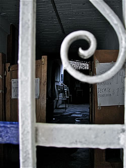
Attached, the photo:
Dorothee
Yes, i like the idea of trying a cover. I would start with your image, and then play with some photo effects, and see how this works. Tell me a bit more about the book size etc.
Rose
The book, I've put it at 5x8 at Create Space, and it comes to 107 pages.
CreateSpace has basically the same template as Lulu, you enter the book size and page numbers, and then you download it, well, you know all this. Let me know if you want me to send you the cover wrap as PDF and PNG file - I was unsure which to use and whether it mattered.
Dorothee
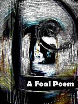
have a look, i played with the window photo in photoshop, enhancing the outlines, and turning it into abstract:
Rose
I love this!! I think it's so really perfect for the book! It's so good with the content. I like that font too. it's very foal-ish. I guess I should double check the page numbers and CS requirements and then we could talk about a cover wrap? Maybe then just the title on the cover, and my name on the spine if possible.... And then, the same image on the back cover, except without the title - or rather: mirroring front and back cover - what do you think?
Dorothee
so glad that you like the cover. it really came together as if it wanted to crystallized like that. it’s good when it works like that – to work with an image, and then move into it, and arrive at an abstract that feels: “yes!”
Revisiting the cover, i remembered that it’s always a good idea to test the cover in thumbnail size, as that's how it will appear in Amazon-listings, or when you use it as twitter-icon etc.. Here's how it looks, it think this works well:

About the wrap: on which platform do you plan to publish it, CreateSpace, right?
Rose
yes, CreateSpace. Here is the link to CreateSpace, all about covers, with the template to download: https://www.createspace.com/Products/Book/CoverPDF.jsp
It's still 107 pages, 5X8 (and will stay that way!) and I checked there is a template available for that.
The page count: unless I get a blurb, in which case it would be 108 pages.... But I do not think 107 or 108 is any different. (?)
Dorothee
thanks for the links – i just checked out the cover template generator, that seems to make things easy.
so this would be the specifications, right?

and yes, 107 or 108 pages is same, or rather: with 107 pages, you also get the 108 pages book. a rule for the page count: you always need a page count that can be devided through 4, for the printing. if you have less pages, they fill it up with white pages.
so i would put together the cover like it is, and a back cover: like a mirror, without book title, otherwise it might be confusing. and then the isbn-field on the backcover, and the logo for your press. and on the spine: book title and your name
about a blurb, i think that is important for books in a shop, as a “talking presenter” of the book. but for books that are mainly ordered online, the better place for a blurb is a website.
Rose
Yes, I really like the cover like it is, without the author name. On the spine it could even just be my name - or my name and the title - I'll leave that one to your judgment. And yes, the back cover a mirror just without the title....
Re the logo and CreateSpace - I might leave the logo off the cover in case CS has a problem with it. In my understanding, with the free, CS-assigned logo, CS regards itself as the publisher. I don't want it to be pulled or you to have to do it again, because it violated something. I will put it inside the book maybe even in a less prominent place and of course the whole cover is like a giant (version of) the logo anyway.
***
PART 2: Creating a cover wrap
Note: to create a cover wrap, you need some photo editing software: Photoshop, GIMP, etc, and need to spend some time with the formatting / resolutions. It's really simpler than it looks at first glance, and is useful for all kinds of photo editing tasks. So it's really worth to figure the figures out for once.
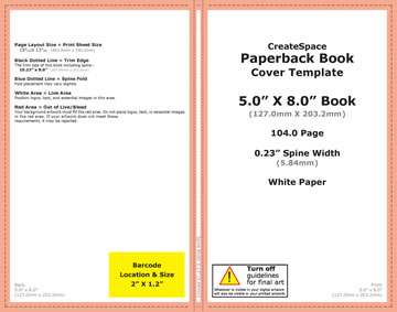
1) configure your template and download it
to do that, enter your details in the specifications box (either in Lulu or CreateSpace). the systems then lead you to Templates. these are like a size model for your cover, and are customized - as they depend on the spine size. the PNG-file works usually better in a photo editor.
here's the template for the 5x8 cover wrap for "Foal":
2) create a high-definition version of your cover
the draft you see in the first part is a low-resolution cover. low resolution is easier and more comfortable to work with in the first steps. yet once the cover draft is ready, it needs to be transformed to high resolution.
to do that, you go back to the original photo. the cover template lists the exact measures of your cover. so you adjust your photo accoridingly: crop it when necessary, and then resize it. here's the key to that: you need to make sure to set the resolution to 300dpi when adjusting size, so that it works for print.
the usual resolution for online images is around 80 dpi. the size of both versions are the same: and on the screen, they look alike, but if you print an 80dpi image it turns out blurry. imagine 2 woven carpet of the same size, and one comes with a lot of knots and details, and others with less. that's what dots per inch are about, their equivalent in the carpet world are the knots-per-inch.
3) create the wrap
so now you have the template and the cover image. now, place the cover image on the template. make sure it covers the visible area and also the borders (the "bleed"). now, create a backcover and the spine. cover, spine, and backcover can be different images placed on the template, or one image that includes all.
for "Foal", i created a cover that also included half of the wrap. then i mirrored the image in the photo editor, and used the mirror version as backcover and other half of the spine. the title is added as text field, same as the spine text. once all is in place, you put the template on top of all, and then turn down the opacity - so the real cover wrap shines through. now check if all fits, and adjust. make sure there is no important text in the yellow field where the bar code will be placed. then check, adjust.. until it all fits.

4) final file
once all fits, remove the template layer. now all that remains is the wrap. here's a miniature of the Foal wrap:

PART 3: Creating a PDF-File
For CreateSpace, you need a PDF-version of the file, same for Lulu if you want to create an own complete wrap. (If you get stuck with the process, then try Lulu first: it includes a cover-creator, where you can upload the frontcover and backcover as single jpg-files, and then get the whole cover wrap as pdf. this is technically easier than doing it all yourself, but doesn't work for layouts with images that continue through the spine).
So back to the PDF-file: to get that, you need a PDF-converter. There are various free online PDF-convertors, the one I use is called "PDF-Creator" and works well (here's the link: pdfforge).
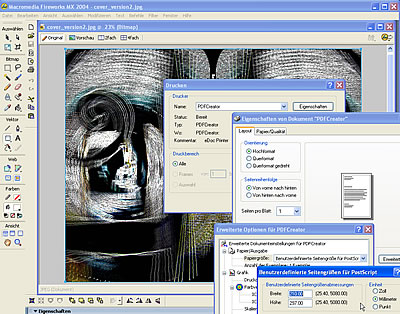
One key to PDFs: from computer logic, creating a PDF works like printing something. You open the file you want to convert (word-document, or in this case, image-file), then click "print", and then choose not your usual printer, but select the pdf converter, and then click "print". That's also the place you can adjust settings: your converter would use the usual paper settings to print, so you have to configure the printing size yourself, and enter the exact size of the cover wrap. The converter then creastes a PDF-file, and asks where to save it. Check the file, and make sure it's 1 single page. If it isn't, try again and adjust the printing size until it all fits.
Here's a screenshot that gives you an idea of how the "printing" looks on the screen, with the size being adjusted in settings. of course, depending on your photo software, and the pdf-converter you use, the details will be different - but the logic behind it always the same. (and if you feel that this is one tedious step: yes. it would be so much easier if photo editors directly created pdfs.)
*
PART 4: Uploading the File and Checking it
Once you have the PDF-version, you can upload the file to the POD-service.
The POD-service then will check the file.
This is the response we received for the first upload of the "Foal"-wrap:
Subject: Files for "A Foal Poem" require your attention
The interior and cover files for A Foal Poem have been reviewed and are printable in their current state:
- The cover file meets our submission requirements; it is not necessary for you to make any revisions to this file or upload it again.The Interior file meets our submission requirements; it is not necessary for you to make any revisions to this file or upload it again.Additionally, we have noted the concerns listed below. You may choose to move forward with the below issues as-is; however, we wanted to bring them to your attention.
- The interior file contains images that range from 119 to 103 DPI, which may appear blurry and pixelated in print. For optimal printing, we recommend all images be at least 300 DPI. Examples of Pages with low-resolution images include but are not limited to: PDF page 3
- The cover file contains spine text. We do not recommend including spine text for books with less than 130 pages as the text will likely wrap to the front or back cover.
Rose
The interior image is a map... it's in 80 dpi. Of course I can resize the map in 300 dpi, right, and then load it into the document.
But what to do with the spine text, remove it?
Dorothee
Yes, good idea to resize the map to 300ppi, and then upload as png or jpg.
Rose
Awesome. Thanks Dorothee. After I emailed you I looked at all my poetry books which are under 100 pages and they have stuff on the spine, so.
I realized the logo wasn't in 300ppi either, so I guess that's what else they meant. OK! So I fixed all that and ready to re-load the ms. :) Although I don't think much will happen until next week since it's a holiday weekend int he US I just heard. I think....
Thanks again, so much, for all your help. :)
Dorothee
Ah, see you are getting the hang on the dpi now! that’s good. i think i might piece together a blog post about it, with the notes form the mail. i guess many struggle with the dpi-thing.
Rose
My initial confusion was: dpi is what? Then I googled it and found oh, it's the same as ppi.
I found this link, which I thought was useful: DPI and PPI explained
I am going to go back and retrace the steps of this cover at some point, see if I can manage the whole thing....
But for now after uploading the new images I went ahead and ordered the proof, so we will soon see how this one turned out!
[* postscript: the proof was received two weeks later, and it all turned out beautifully....]
----
THE BOOK!
..and another couple of weeks later, the book was featured in this blog, so if you are curious for the actual content behind the cover, here's more: A Foal Poem - Dorothee
*
THANKS FOR THE LOVELY COMMENTS! I AM GLAD YOU LIKE THE POST ASWELL! MORE TO COME!
ReplyDeletePrint on Demand - Make sure your manuscript is as good as it can be with our affordable editing and proof reading services.
This is nice blog helpful for online travel and tourism. Thanks for sharing this nice blog. Please visit this link………. My India Tourism .
ReplyDeleteThe blog was absolutely fantastic! Lot of information is helpful in some or the other way. Keep updating the blog, looking forward for more content...Great job, keep it up.
ReplyDeleteOn Demand Print Services
Thanks for the interesting information!
ReplyDeleteEureka Printing
I'm on the fence about this, while more customization is good, I have a feeling this is a "in-progress" update, it just feels incomplete and half-way there.
ReplyDeleteWe use badge layout for apps on design approvals (visual projects), so the image being displayed is important. Old layout "feels like" it had larger images,
maybe because the images were cropped more loosely so it's easier to tell which project it was at quick glance. Now the image is cropped closer, making it
harder to scan thru at quick glance. I find myself needing to click into the project more often than usual. Which makes the whole user experience less
efficient.
I have a couple suggestions that might make it work better:
1. Increase the height of the window the cover image is being displayed.
2. Let us to choose which image to be displayed as "cover" (like how Pinterest handles cover images of each board, was hoping for this for a long time)
3. Let us adjust which part of the image to show and how tight or loose the crop is (with a fixed window, let us move the image around and maybe enlarge or
shrink it to control what shows thru the window. Pinterest does a limited form of this, which is very useful in making the cover image relevant)
4. Allow Cover Image to be ordered in different hierarchy (currently every element can be ordered differently except the Cover Image, it seems to be stuck
in the 2nd spot, would like the option to set it on another spot in the layout. This one seems like an easy fix, since you guys allow that for every other
element already)